Howdy, Stranger!
We are about to switch to a new forum software. Until then we have removed the registration on this forum.
Categories
- All Categories 25.7K
- Announcements & Guidelines 13
- Common Questions 30
- Using Processing 22.1K
- Programming Questions 12.2K
- Questions about Code 6.4K
- How To... 4.2K
- Hello Processing 72
- GLSL / Shaders 292
- Library Questions 4K
- Hardware, Integration & Other Languages 2.7K
- Kinect 668
- Arduino 1K
- Raspberry PI 188
- Questions about Modes 2K
- Android Mode 1.3K
- JavaScript Mode 413
- Python Mode 205
- Questions about Tools 100
- Espanol 5
- Developing Processing 548
- Create & Announce Libraries 211
- Create & Announce Modes 19
- Create & Announce Tools 29
- Summer of Code 2018 93
- Rails Girls Summer of Code 2017 3
- Summer of Code 2017 49
- Summer of Code 2016 4
- Summer of Code 2015 40
- Summer of Code 2014 22
- p5.js 1.6K
- p5.js Programming Questions 947
- p5.js Library Questions 315
- p5.js Development Questions 31
- General 1.4K
- Events & Opportunities 288
- General Discussion 365
In this Discussion
- jeremydouglass March 2017
- Joey March 2017
- koogs March 2017
grafica replacing axis ticks with new strings
Is there a way to change to replace the label ticks for the x/y axis with a string instead of the associated number? For example let's look at this code:
import grafica.*;

GPlot plot;

GPointsArray myArray = new GPointsArray(0);

void setup() {
  size(500, 500);

  plot = new GPlot(this, 0, 0, 500, 500);

  myArray.add(0, 0);
  myArray.add(1, 1);
  myArray.add(2, 2);
  myArray.add(3, 3);
  myArray.add(4, 4);
  myArray.add(5, 5);

  plot.setPoints(myArray);
  plot.defaultDraw();
}
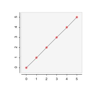
It creates this graph:

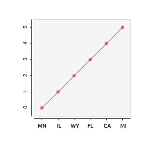
I need it to appear like this by replacing each tick with a new string:


Answers
according to this:
https://github.com/jagracar/grafica/blob/master/src/grafica/GPointsArray.java#L171
there's another GPointsArray.add() call that allows a label.
I tried doing this but it still only shows numbers when drawing the graph:
Aren't GPointsArray labels meant to be the labels for individual data points? I think the documentation for axis labels is here:
...or maybe not. Now that I glance over it, I'm not sure.
ah, ok.
i based my answer on a couple of minutes of searching on my phone, specifically the Gaussian bit of this example:
http://jagracar.com/sketches/multiplePlots.php
i figured the H labels at the bottom there were similar to the requirements
which is line 85 here https://github.com/jagracar/grafica.js/blob/master/examples/multiplePlots.js#L85
or line 217
https://github.com/jagracar/grafica.js/blob/master/examples/multiplePlots.js#L217
BUT that's javascript.
the relevant java versions are here (Lines 83 and 211):
https://github.com/jagracar/grafica/blob/master/examples/MultiplePlots/MultiplePlots.pde
and look like this:
so i don't really understand why that's not working based on the 5 minutes i've looked at it 8)
maybe i should try running this...
ok, i have had a play
replace the plot.defaultDraw() with this, which draws all the bits
and you get labels. for the histogram.
the same thing doesn't happen when you use drawPoints(). tbh, labels make more sense for histograms than for points...
i think the points equiv is
https://github.com/jagracar/grafica/blob/master/src/grafica/GPlot.java#L2764
which, as jeremy points out, labels the point (on mouseover), not the axis
Interesting solution, @koogs ! For some reason when I take the OP sketch and replace
plot.defaultDraw()with your eight lines, above, as per your instructions, I get aNullPointerExceptionon your line:Is there a bit more setup needed?
(That's on Processing 3.2.3 with grafica 1.7.0.)
Oh there might've been a line added to the graph setup (which was separate from the drawing code). But I can't remember what it was and I've deleted the sketch now. It was based on the Java example linked above.
Probably this
That worked, thanks. A histogram, as you said, not a line graph as OP requested -- but it has category axis labels, and the bars probably make more sense for categorical data.
Thanks for your responses. I was specifically looking for labels for line graphs though. Fortunatly I found it! Check out setTickLabels()
Solution to my original example:
Thanks for sharing that solution, @Joey.
For the curious: none of the grafica example sketches demonstrate the use of
GAxis.setTickLabels(), but you can find the method here: