Howdy, Stranger!
We are about to switch to a new forum software. Until then we have removed the registration on this forum.
Categories
- All Categories 25.7K
- Announcements & Guidelines 13
- Common Questions 30
- Using Processing 22.1K
- Programming Questions 12.2K
- Questions about Code 6.4K
- How To... 4.2K
- Hello Processing 72
- GLSL / Shaders 292
- Library Questions 4K
- Hardware, Integration & Other Languages 2.7K
- Kinect 668
- Arduino 1K
- Raspberry PI 188
- Questions about Modes 2K
- Android Mode 1.3K
- JavaScript Mode 413
- Python Mode 205
- Questions about Tools 100
- Espanol 5
- Developing Processing 548
- Create & Announce Libraries 211
- Create & Announce Modes 19
- Create & Announce Tools 29
- Summer of Code 2018 93
- Rails Girls Summer of Code 2017 3
- Summer of Code 2017 49
- Summer of Code 2016 4
- Summer of Code 2015 40
- Summer of Code 2014 22
- p5.js 1.6K
- p5.js Programming Questions 947
- p5.js Library Questions 315
- p5.js Development Questions 31
- General 1.4K
- Events & Opportunities 288
- General Discussion 365
In this Discussion
- NT3 April 2016
- stomachion May 2016
Temperature Max and Min on an Arc
Hey guys,
I'm new to Processing. I was wondering if someone could teach me how to make charts like the attached image. I'm using a .csv file and tried to come up with something by watching the MeteorStrikes tutorial by Nicholas Felton but it's pretty different. Hope someone could help me out! Thank you!!!


Tagged:

Answers
One way: 1. translate the coordinate origin to the centre of the dial. 2. rotate coordinate axes for the hour of the day. 3. plot the triangle (I'd do it straight up to take advantage of symmetry about the axis), scaled for magnitude using map().
Plotting those triangles looks like it'll take many parallel lines to get the color gradient, using map to control the hue.
Could you plot them with arcs instead? I think it'll look better and be less ambiguous. With triangles, I don't know which point on the far end represents the temperature because they're at different radii. Or is it the area that represents temperature (and rainfall)?
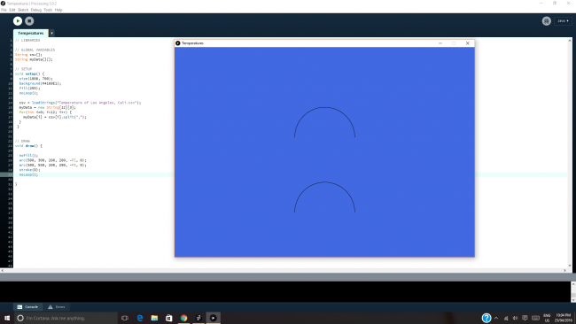
Here's a start:
Thank you very much @stomachion for your time! I'll try to continue and play around with the code.
Post back so we can see how you got on, and what you created!