Howdy, Stranger!
We are about to switch to a new forum software. Until then we have removed the registration on this forum.
Categories
- All Categories 25.7K
- Announcements & Guidelines 13
- Common Questions 30
- Using Processing 22.1K
- Programming Questions 12.2K
- Questions about Code 6.4K
- How To... 4.2K
- Hello Processing 72
- GLSL / Shaders 292
- Library Questions 4K
- Hardware, Integration & Other Languages 2.7K
- Kinect 668
- Arduino 1K
- Raspberry PI 188
- Questions about Modes 2K
- Android Mode 1.3K
- JavaScript Mode 413
- Python Mode 205
- Questions about Tools 100
- Espanol 5
- Developing Processing 548
- Create & Announce Libraries 211
- Create & Announce Modes 19
- Create & Announce Tools 29
- Summer of Code 2018 93
- Rails Girls Summer of Code 2017 3
- Summer of Code 2017 49
- Summer of Code 2016 4
- Summer of Code 2015 40
- Summer of Code 2014 22
- p5.js 1.6K
- p5.js Programming Questions 947
- p5.js Library Questions 315
- p5.js Development Questions 31
- General 1.4K
- Events & Opportunities 288
- General Discussion 365
In this Discussion
- AverageJoe April 2016
- erkosone April 2016
- GoToLoop April 2016
- KevinWorkman May 2015
- unparadise May 2015
Ideas for Processing v3 IDE GUI
Dear everyone,
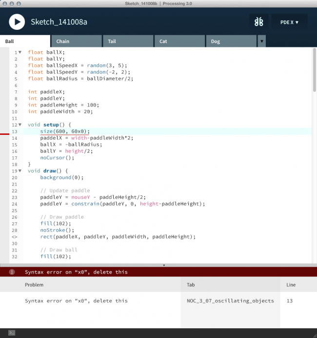
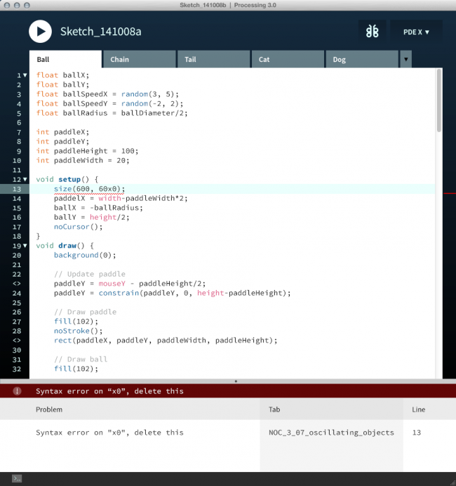
I am a user experience designer who is learning Processing. I saw Ben and Casey's post on Github about the new UI for v3 the other day and played with it a little bit. There are 2 big changes I made in the new version.
Below is the new proposal.

The first change is extending the tabs at the top all the way to the left so that the line numbers column and the debugging column feel like they belong to each tab. Here is why I think this change makes sense and provides a better user experience. I am assuming that when the user switches between tabs the IDE would retain the scrolling position of each tab. If my assumption is true, then making the line numbers column and the debugging columns visually part of the tab reinforce that concept.
The second change is moving the debugging column from the right side of the IDE to the left side. When the user debugs the program it's beneficial to be able to quickly connect the breakpoint with a specific line of code (line number). Having the debugging column coupled with the line number column helps to make scanning easy - especially when the user widens the IDE.
Below is the UI comp I saw from Ben and Casey.

These are just my personal ideas of how to improve the UI. I'd love to hear suggestions and feedbacks.
Cheers, UnParaDisE


Comments
The red line on the right side is so you can easily scroll to the line with the error.. I don't mind putting it on the left as well, but I don't think you should remove it from the right completely.
Most IDEs will mark an error in 3 places: one on the line number on the left, one on the line itself, and one on the right next to the scroll bar.
@KevinWorkman Thank you for your feedback, Kevin. I have created another design that moved the debug column back to the right. So, basically, the big change I am suggesting is to extend the tabs at the top all the way to the left.
I personally think that the line number column and the debug column are better with light color.
bump!
I have always had a hard time seeing if the file is modified or not. The pastel yellow on white-blue strains my eyes. Personally I would prefer a bold line of pure (0, 255, 255) bright blue, or the option to change it at least. Something obvious but non-offensive, you know?
https://GitHub.com/processing/processing/issues
Thanks! :D
It would be good to change the syntax highlighting from the IDE , and you can edit the type of editor , the background color etc.